Yasui Architects & Engineers
Website Renewal
Yasui site can be visited here
STRATEGY
Project Outline
Yasui is a Japanese architecture firm based in Osaka. They have branches throughout Japan with offices in Vietnam and Taiwan.
Due to Yasui’s growth over the past few years, and a shift in their brand focus to emphasize a more humanistic approach to architecture, there was a need to reorganize the information on their website.
Additionally, new content types needed to be accommodated, and there was discussion about making the entire site available not only in the original Japanese but also as a fully translated English mirror. Previously, only select pages had been translated.
My team undertook the project to modernize the website and restructure it in a way that aligned with these goals, while also addressing the pain points that had emerged in the previous design.
Key Roles / Responsibilities
UX/UI Designer
Analytics Analysis
Information Architecture
Interaction Design
Art Direction / Visual Design
Wireframing
Prototyping
Project Duration
October 2023 - December 2024
Analytics
The analytics gave us the following insights:
The large majority of users are accessing from Japan
Nearly 60 percent of users are accessing the site from a desktop environment
Most users are flowing through the about page and the architecture projects pages
The average user session varies accross languages but range from 2 to 6 minutes roughly
From these insights we can make an informed decision about certain aspects of development. Such as taking a desktop first approach and prioritising the usability and design of the about and project pages.
We can also see areas that need improvement. Such as the low number of English users and raising the priority of other pages that are accessed less frequently.
SCOPE
The Challenge
A full website renewal was requested for several reasons. Primarily, these included: integrating a news section into the site, increasing the visibility of the company’s core design principles as well as its new recruiting portal site, and enhancing the functionality and visual design of the project pages.
English visitor numbers were low, so this aligned with improving the English version of the site. We also needed to retain interest in the projects and about pages, as those were seen as the core of the brand, so adding in new sections or raising the priority of existing sections had to be done carefully.
Additionally, there was a need to improve overall usability and reassess the information architecture due to numerous post-launch updates to the previous version of the site. The mobile design also needed to be highly usable as there was still a fair percentage of users viewing the site on mobile devices.
A separate but related challenge was the very tight schedule for both design and development, allowing only three months for the UX process and full design to be completed.
STRUCTURE
Content Focused Site Map
This is the final iteration of the site map. We started with the client’s requests, which included adding new sections and raising the priority of some existing ones. We then considered each page and identified the essential content for each. For example, the projects’ top page required a filter system and a search function.
This style of site map not only helps minimize surprises once the project moves to wireframing but also helps the client visualize what will be included on each page.
The purple highlighted area still underwent some changes after the wireframing process began. This was anticipated, and we planned the next phase accordingly.
SKELETON
Wireframe Selection
Wireframes - Navigation
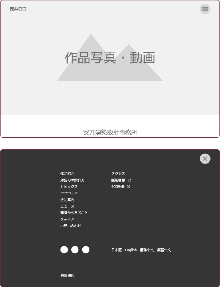
We needed to include a large number of pages in the main navigation while maintaining a minimal and high-quality feel for the home page. To satisfy both goals, we decided that a hamburger button and full-screen navigation would be the best solution.
This approach minimizes visual noise on the pages and gives users a more focused navigation experience.
Wireframes - Unique Interaction Patterns
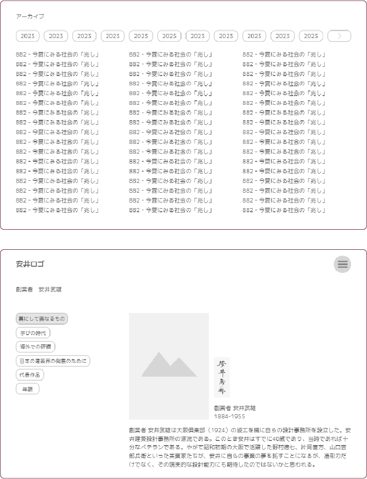
Presented here are two pages with unique interactions.
At the top is an archive for the CEO’s weekly articles. Given the large volume of articles, we aimed for a design that required minimal clicks to navigate, allowed users to access an entire year at a glance, and could expand in the future without compromising the design. The chosen pattern proved to be far more enjoyable to use than a series of dropdown menus.
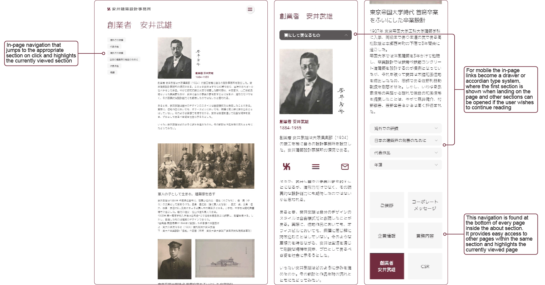
The second page shown is the founder history page. This section contains a substantial amount of information, which we felt would be best presented as a long-form piece of writing. To avoid requiring users to click through multiple pages, while still catering to more motivated readers who wish to explore the content linearly, we implemented an in-page link system. This system follows the user as they scroll, highlighting the current section on the left. A single click allows users to jump to any section on the page.
SURFACE
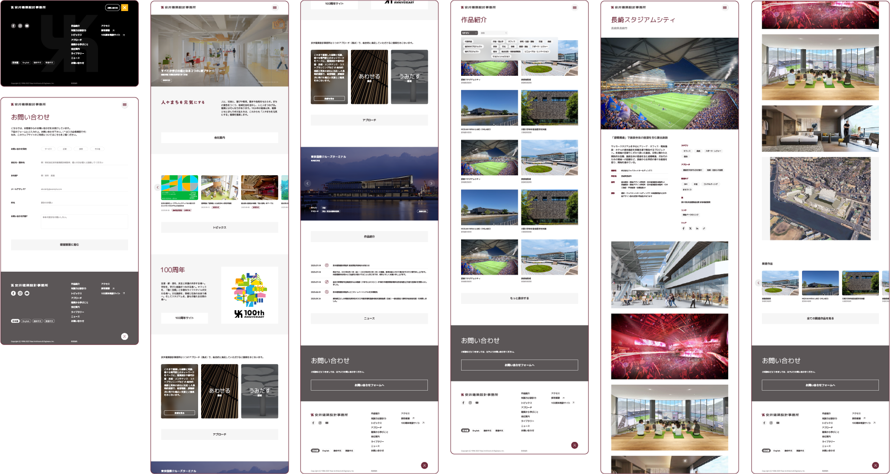
Desktop Page Designs
Mobile Page Designs
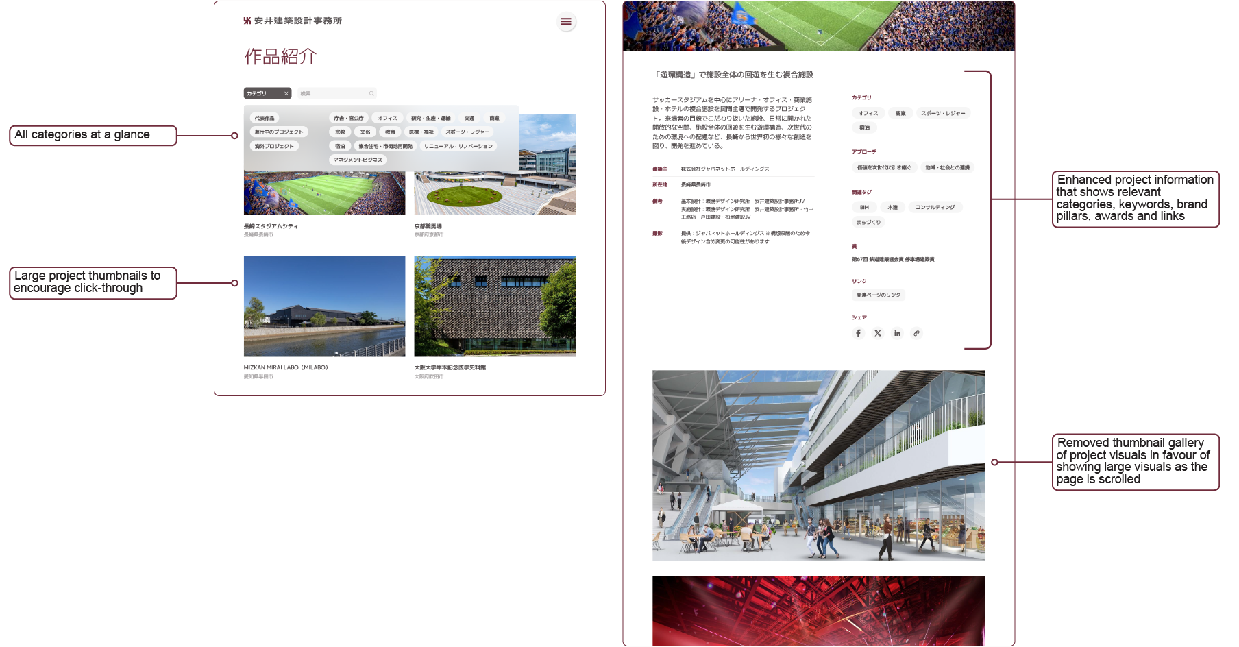
Architecture Projects Design Details
Founder Page Design Details
WRAP UP
Impact And Outcome
The overall outcome of the site renewal was positive. Some key successes include:
10% increase in access from mobile
150% increase in English speaking users
Projects page remained popular
Increased traffic to recruiting site
One challenge we faced during development was the client’s initial reluctance to translate the entire site into English. However, given their ambition to expand beyond Japanese borders, we successfully convinced them that a full English version would encourage English speaking visitors to engage more deeply with the site, resulting in increased time spent and higher conversions.
The previous English site was limited, negatively impacting the user experience. Implementing a full mirror site proved to be the right decision, as the results clearly demonstrate improved user engagement.
Our work on the site renewal received such high praise that we established a retainer contract with Yasui and continue collaborating with them on various projects to this day.
